Responsive CSS
Introducing media Queries
              .small-font {
                font-size: 10px;
              }

              @media screen and (max-width: 600px) {
                .small-font {
                  font-size: 20px;
                }
              }
Screen?
              @media screen and (max-width: 600px) {
                body {
                  background-color: blue;
                }
              }
Print!
              @media print {
                body {
                  background-color: white;
                }
              }
Min or Max
              body {
                background-color: red;
              }

              @media screen and (max-width: 600px) {
                body {
                  background-color: blue;
                }
              }

              @media screen and (min-width: 900px) {
                body {
                  background-color: green;
                }
              }
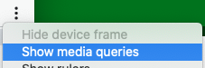
Debugging!
- Open developer tools
-
Click the Device Toolbar icon

-
Click the "snowman" and "show media queries"